COBBO Robotics · AGD do kuchni
Robot kuchenny Cobbo 7 Smart-i
3 304,40 zł
Dostępny · wysyłka po zaksięgowaniu płatności
/* Desktop: 3 kolumny obok siebie */ #smarti-introatut-grid >div { width: calc(33.33% – 15px) !important; display: block !important; } /* Mobile: Poziome pasy jeden pod drugim…
- 14 dni na zwrot bez podania przyczyny
- Bezpieczna płatność online
- Zamówienie bez zakładania konta
- Koszt dostawy widoczny przed potwierdzeniem zamówienia
Opis
O tym produkcie


Opinie naszych klientów
Sprawdź doświadczenia osób, które już korzystają z naszych urządzeń.
#cobbo-product-module { display: flex; justify-content: center; padding: 40px 0; font-family: Arial, sans-serif; } #cobbo-selector { display: flex; gap: 12px; justify-content: center; text-align: center; } #card1, #card2, #card3 { cursor: pointer; } #box1, #box2, #box3 { border: 2px solid #ddd; border-radius: 6px; padding: 8px; background: #fff; width: 120px; box-sizing: border-box; } #card1.active #box1, #card2.active #box2, #card3.active #box3 { border-color: #ddd; } #img1, #img2, #img3 { max-width: 100%; display: block; margin: 0 auto 6px; } #name1, #name2, #name3 { margin-top: 6px; font-size: 13px; font-weight: 600; } #price1, #price2, #price3 { font-size: 12px; margin-bottom: 6px; } #btn1, #btn2, #btn3 { display: inline-block; padding: 4px 10px; font-size: 11px; text-decoration: none; background: #ffd500; color: #fff; border-radius: 4px; font-weight: 600; } #btn1:hover, #btn2:hover, #btn3:hover { opacity: 0.9; } @import url(https://v1.fontapi.ir/css/SFProDisplay); .product-opinions { padding: 40px !important; /* Adjust as needed */ max-width: 1200px !important; margin: 0 auto !important; } #gradient-text { background: #FF4900; background-size: 200%; background-clip: text; -webkit-background-clip: text; color: transparent; animation: colorChange1 5s infinite; } @keyframes colorChange1 { 0%, 33% { background: #FF4900; background-size: 300% 100%; background-position: center; background-clip: text; -webkit-background-clip: text; color: transparent; } 34%, 100% { background: none; color: #a9a9a9; } } @keyframes colorChange2 { 0%, 33% { background: none; color: #a9a9a9; } 34%, 66% { background: #FF4900; background-size: 300% 100%; background-position: center; background-clip: text; -webkit-background-clip: text; color: transparent; } 67%, 100% { background: none; color: #a9a9a9; } } @keyframes colorChange3 { 0%, 66% { background: none; color: #a9a9a9; } 67%, 100% { background: #FF4900; background-size: 300% 100%; background-position: center; background-clip: text; -webkit-background-clip: text; color: transparent; } } #line1 { animation: colorChange1 6s infinite; font-weight: bold; font-size: 24px; } #line2 { animation: colorChange2 6s infinite; font-weight: bold; font-size: 24px; } #line3 { animation: colorChange3 6s infinite; font-weight: bold; font-size: 24px; } @keyframes levitate { 0% { transform: translateY(0); } 50% { transform: translateY(-8px); } 100% { transform: translateY(0); } } /* Allow the tab-content to extend the full width of the page */ .product-card.mod-product-card-1 .tab-content { width: 100vw; /* 100% of the viewport width */ margin-left: calc(-50vw + 50%); /* This centers the full-width content */ padding: 20px; /* Add padding to ensure content is readable */ background-color: #fff; /* Optional: To distinguish the description section */ } /* Ensure the .tab-content spans 100% width without affecting product-info */ .product-card.mod-product-card-1 .tab-content .row { max-width: 100%; /* Override any width restrictions */ margin: 0 auto; /* Center the content */ } /* Keep the first col-md-12 (product info, buttons, etc.) intact */ .product-card.mod-product-card-1 .col-md-12:first-of-type { max-width: 1270px; /* Retain the current layout for the first section */ margin: 0 auto; /* Center it like before */ } div[data-tab=”product-safety-information”] { margin: 20px !important; /* Adjust as needed */ padding: 40px !important; /* Adjust as needed */ max-width: fit-content; } div[data-tab=”product-safety-information”] .tab-content { margin: 35px !important; /* Adjust as needed */ padding: 25px !important; max-width: fit-content; /* Adjust as needed */ } #pagination { display: flex; justify-content: center; /* Center the dots */ gap: 8px; margin-top: 10px; } #pagination div { width: 16px; height: 4px; border-radius: 5px; background-color: #e6e6e6; transition: background-color 0.3s ease; } #tytul-czarny-center { font-family: „SF Pro Display”, sans-serif; font-size: 60px; font-weight: 600; word-wrap: break-word; line-height: 1; text-align: center; margin-top: 50px; color: #000; } #tytul-czarny-left { font-family: „SF Pro Display”, sans-serif; font-size: 80px; font-weight: 700; word-wrap: break-word; line-height: 1; text-align: left; margin-top: 50px; color: #000; } #tytul-bialy-center { font-family: „SF Pro Display”, sans-serif; font-size: 3.75em; font-weight: 700; word-wrap: break-word; line-height: 1.15; text-align: center; margin-top: 50px; color: #fff; } @media (max-width: 768px) { @keyframes slide { 0% { transform: translateX(0); } 100% { transform: translateX(-330%); } } /* Make the icon grid a single column and center everything */ #tuya-icons-grid { display: grid; grid-template-columns: 1fr; /* One icon per row */ row-gap: 20px; /* Space between rows */ justify-items: center; /* Center each icon+text block horizontally */ width: 100%; /* Let it span the container’s width */ margin: 0 auto; /* Center the grid if there’s extra space */ } /* Scale icons proportionally and center text */ #tuya-icons-grid img { max-width: 70%; /* Adjust as desired (e.g., 50%, 80%, etc.) */ height: auto; margin-bottom: 10px; /* Space under the icon */ display: block; /* Ensure margin works properly */ } #tuya-icons-grid p { text-align: center; /* Center-align the text below each icon */ margin: 0; font-family: „SF Pro Display”, sans-serif; font-size: 20px; font-weight: 500; } /* Change the multi-grid container to a 2-column grid */ #multi-grid { display: grid; grid-template-columns: repeat(2, 1fr); gap: 20px; /* space between items */ justify-items: center; /* center each item horizontally */ align-items: center; width: 100%; margin: 0 auto; } /* Scale down icons and center them */ #multi-grid img { max-width: 80%; /* adjust this value as needed */ height: auto; display: block; margin: 0 auto; } /* Center text below each icon */ #multi-grid span { display: block; text-align: center; margin-top: 5px; font-family: „SF Pro Display”, sans-serif; font-size: 20px; font-weight: 500; } #intro-text1 { max-width: 90%; margin: 0 auto; /* Centers the text block if parent is wider */ font-family: „SF Pro Display”, „SF Pro Text”, „Helvetica Neue”, Arial, sans-serif; font-weight: 600; font-size: 24px; line-height: 28px; color: #6e6e6e; /* Approx. rgb(110, 110, 110) */ } #app-box-main-container { width: 100%; padding: 10px; } #app-box-text-blocks { width: 100%; display: flex; flex-direction: column; align-items: center; } #app-box-left-block { width: 100%; margin-bottom: 20px; padding: 0 10px; text-align: left; } #app-box-right-block { width: 100%; margin-bottom: 20px; padding: 0 10px; text-align: left; } #app-box-right-block p { font-size: 1.5rem; text-align: left; } #app-box-text-blocks { width: 100%; max-width: 1200px; display: flex; align-items: flex-start; justify-content: space-between; } #container { display: flex; flex-wrap: wrap; gap: 10px; justify-content: space-between; font-family: „SF Pro Display”, sans-serif; } #tytul-bialy-left { font-family: „SF Pro Display”, sans-serif; font-size: 60px; font-weight: 700; word-wrap: break-word; line-height: 1; text-align: center; margin-top: 50px; color: #fff; } #content-container { display: flex; flex-wrap: wrap; justify-content: space-evenly; } #content-container, #content-item, #content-item2, #content-item:last-child, #content-text { display: flex; flex-direction: column; align-items: flex-start; } #content-container { display: flex; flex-wrap: wrap; } #content-image, #content-text { width: 100%; margin-right: 0; border-radius: 20px; } #content-item { width: 30%; margin-bottom: 20px; display: flex; flex-direction: column; align-items: center; text-align: center; } #content-item img, #content-item2 img { max-width: 100%; height: auto; align-items: center; border-radius: 10px; } #content-item2 { width: 30%; margin-bottom: 20px; display: flex; flex-direction: column; align-items: center; text-align: center; } #content-item2:last-child { margin-right: 0; } #custom-container { position: relative; padding: 20px; display: flex; align-items: center; justify-content: center; background-color: #fff; } #custom-content { display: flex; align-items: center; text-align: center; } #custom-subtitle { margin-top: 30px; margin-left: 20px; color: #86868b; font-family: „SF Pro Display”, sans-serif; font-size: 28px; font-weight: 600; letter-spacing: 0.007em; line-height: 1; text-align: start; } #custom-title { margin: 10px 0; margin-left: 20px; text-align: start; font-family: „SF Pro Display”, sans-serif; font-size: 60px; font-weight: 700; word-wrap: break-word; line-height: 1; } #description-text { margin-top: 40px; color: #86868b; font-family: „SF Pro Display”, sans-serif; font-size: 28px; font-weight: 600; letter-spacing: 0.007em; line-height: 1.1428571429; } #description-text2 { margin-bottom: 40px; font-family: „SF Pro Display”, sans-serif; font-size: 1.2rem; } #div1 { grid-area: 1/1/2/2; } #div10 { grid-area: 3/2/4/3; } #div11 { grid-area: 4/2/5/3; } #div12 { grid-area: 5/2/6/3; } #div13 { grid-area: 6/2/7/3; } #div14 { grid-area: 3/4/4/5; } #div15 { grid-area: 4/4/5/5; } #div16 { grid-area: 5/4/6/5; } #div2 { grid-area: 2/1/3/2; } #div3 { grid-area: 3/1/4/2; } #div4 { grid-area: 4/1/5/2; } #div5 { grid-area: 5/1/6/2; } #div6 { grid-area: 6/1/7/2; } #div7 { grid-area: 7/1/8/2; } #div8 { grid-area: 1/2/2/3; } #div9 { grid-area: 2/2/3/3; } #flex-container { max-width: 1200px; margin: 0 auto; display: grid; grid-template-columns: repeat(4, 1fr); grid-template-rows: repeat(6, auto); gap: 16px; } #flex-item { padding: 16px; text-align: center; border: 1px solid #ddd; border-radius: 8px; } #flex-item img { max-width: 100%; height: auto; } #flex-item span { font-weight: 700; } #food-slider { display: flex; animation: slide 30s linear infinite; } #food-slider img { width: 250px; height: 205px; margin: 0 5px; box-shadow: 0 4px 8px rgba(0, 0, 0, 0.2); border-radius: 15px; object-fit: cover; } #food-slider p { max-width: 240px; margin-top: 10px; margin-left: 18px; color: #ffffff; font-family: „SF Pro Display”, sans-serif; font-size: 20px; font-weight: 600; text-align: left; white-space: normal; word-wrap: break-word; } #food-slider-container { box-sizing: border-box; width: 100%; height: 300px; padding: 10px 0; white-space: nowrap; } #food-slider::after { content: „”; display: flex; } #food-slider-item { margin: 0 5px; flex: 0 0 auto; text-align: center; } #hide-text { margin: 0; padding: 0 10%; color: #bdbdbd; font-family: „SF Pro Display”, sans-serif; font-size: 1vw; font-weight: 500; text-align: center; } #hide-text1 { margin: 0; } #image-container { max-width: 90%; margin-bottom: 20px; display: flex; flex: 1; align-items: center; justify-content: center; text-align: center; } #image-container img { max-width: 100%; height: auto; } #img-tytul { display: flex; } #item1, #item10, #item11, #item12, #item13, #item2, #item5, #item6 { grid-column: span 2; grid-row: span 2; } #item1, #item2, #item6 { grid-column: span 3; } #item10, #item11, #item12, #item13, #item3, #item5, #item7, #item8 { grid-column: span 2; } #item4, #item9 { grid-column: span 1; grid-row: span 3; } #left-text { padding: 10px; } #right-text { width: 100%; padding: 10px; } #left-text { font-family: „SF Pro Display”, sans-serif; font-size: 5em; font-weight: 700; text-align: right; } #misa-parent { width: 100%; margin: 0 auto; padding: 10px; display: flex; flex-direction: column; align-items: center; background-color: #000; color: #fff; } #misa-middle { width: 100%; margin-bottom: 20px; } #misa-middle-image { width: 100%; height: auto; object-fit: cover; } #misa-left { margin-left: 40px; } #misa-right { width: 100%; padding: 10px; text-align: center; } #misa-left-title { font-size: 60px; box-sizing: border-box; margin-left: 0; text-align: start; line-height: 1; margin-left: 20px; } #misa-left-text { width: 95%; color: #86868b; font-family: „SF Pro Display”, sans-serif; font-size: 20px; font-weight: 600; letter-spacing: 0.011em; line-height: 1.381002381; text-align: start; } #misa-right-function1, #misa-right-function2, #misa-right-function3, #misa-right-function4 { width: 100%; margin-bottom: 20px; } #misa-right-function1-title, #misa-right-function2-title, #misa-right-function3-title, #misa-right-function4-title { color: #0a84ff; font-family: „SF Pro Display”, sans-serif; font-size: 60px; font-weight: 750; } #misa-right-function1-text, #misa-right-function2-text, #misa-right-function3-text, #misa-right-function4-text { font-family: „SF Pro Display”, sans-serif; font-size: 20px; line-height: 1.5em; } #nawigacja-image-container { position: relative; width: 100%; height: auto; overflow: hidden; } #nawigacja-image-container img { position: absolute; top: 0; left: 0; width: 100%; height: 100%; /* Ensure images take the full height */ object-fit: cover; /* Ensure the images fill the container properly */ opacity: 0; /* Start with all images hidden */ transition: opacity 1s ease-in-out; /* Smooth transition for opacity */ } #nawigacja-main-container { padding: 20px; display: flex; flex-wrap: nowrap; align-items: flex-start; justify-content: space-between; background-color: #fff; } #nawigacja-subtitle { margin: 10px 0; font-family: „SF Pro Display”, sans-serif; font-size: 1.3em; word-wrap: break-word; } #nawigacja-text-container { max-width: 600px; margin-left: 20px; display: flex; flex-direction: column; justify-content: center; } #nawigacja-title { margin: 0; font-family: „SF Pro Display”, sans-serif; font-size: 4em; font-weight: 700; word-wrap: break-word; } #parent { display: grid; grid-column-gap: 10px; grid-row-gap: 10px; grid-template-columns: repeat(2, 1fr); grid-template-rows: repeat(8, auto); } #parent div { display: flex; align-items: center; justify-content: center; } #parent img { width: 130px; height: 130px; border-radius: 50%; object-fit: cover; } #przepisy-right { padding: 20px; display: flex; flex-direction: column; align-items: flex-end; justify-content: center; text-align: right; } #przepisy-right-function1, #przepisy-right-function2, #przepisy-right-function3 { margin-bottom: 20px; } #przepisy-right-function1-text, #przepisy-right-function2-text, #przepisy-right-function3-text { font-family: „SF Pro Display”, sans-serif; font-size: 1em; line-height: 1.5em; } #przepisy-right-function1-title, #przepisy-right-function2-title, #przepisy-right-function3-title { margin-bottom: 10px; font-family: „SF Pro Display”, sans-serif; font-size: 2em; } #przepisy-right-function1-title { color: #0a84ff; font-size: 2.5em; font-weight: 750; } #product-description, #product-reviews, #product-title { width: 100%; padding: 10px; word-wrap: break-word; text-align: center; } #product-description, #product-reviews { font-size: 20px; } #product-overview { width: 100%; display: flex; flex-direction: column; align-items: center; } #product-reviews { margin-top: 30px; font-family: „SF Pro Display”, sans-serif; line-height: 1.5; } #product-reviews b { font-weight: 700; } #product-title { font-family: „SF Pro Display”, sans-serif; font-size: 4em; word-wrap: break-word; font-weight: 700; } #right-text { text-align: left; } #robot-image2 { width: auto; height: 150px; margin-right: 20px; margin-bottom: -20px; } #sentence1 { animation: colorChange1 9s steps(1) infinite; } #sentence2 { animation: colorChange2 9s steps(1) infinite; } #sentence3 { animation: colorChange3 9s steps(1) infinite; } #smartstart-left { padding: 20px; display: flex; flex-direction: column; justify-content: center; } #smartstart-left-text { margin-bottom: 1rem; margin-left: 0; font-family: „SF Pro Display”, sans-serif; font-size: 1.5rem; line-height: 1.5em; } #smartstart-left-title { margin-bottom: 2rem; margin-left: 3rem; font-family: „SF Pro Display”, sans-serif; font-size: 2em; font-weight: 700; } #smartstart-middle { display: flex; align-items: center; justify-content: center; overflow: hidden; } #smartstart-middle-image { max-width: 100%; max-height: 100%; object-fit: contain; } #smartstart-parent { height: 100vh; margin: 0; padding: 0; display: grid; grid-template-columns: 1fr 1fr 1fr; background-color: #fff; color: #000; font-family: Arial, sans-serif; } #smartstart-right { padding: 20px; display: flex; flex-direction: column; justify-content: flex-start; text-align: left; } #smartstart-right-function1, #smartstart-right-function2, #smartstart-right-function3, #smartstart-right-function4 { margin-bottom: 20px; } #smartstart-right-function1-text, #smartstart-right-function2-text, #smartstart-right-function3-text, #smartstart-right-function4-text { font-family: „SF Pro Display”, sans-serif; font-size: 1em; line-height: 1.5em; } #smartstart-right-function1-title, #smartstart-right-function2-title, #smartstart-right-function3-title, #smartstart-right-function4-title { margin-bottom: 10px; font-family: „SF Pro Display”, sans-serif; font-size: 2.5em; } #smartstart-right-function1-title { color: #0a84ff; font-weight: 750; } #title-text { padding: 10%; font-weight: 400; text-align: center; } #tytul { display: flex; justify-content: center; background-color: #fff; color: #000; font-family: „SF Pro Display”, sans-serif; font-size: 6em; font-weight: 800; text-align: center; } #app-box-left-block { width: 100%; color: #86868b; font-family: „SF Pro Display”, sans-serif; font-size: 21px; font-weight: 600; letter-spacing: 0.011em; line-height: 1.381002381; } #app-box-right-block { width: 100%; color: #86868b; font-family: „SF Pro Display”, sans-serif; font-size: 18px; font-weight: 600; letter-spacing: 0.011em; line-height: 1.381002381; } #app-box-left-block p, #app-box-right-block p { margin-top: 10px; padding: 0; } #app-box-left-block p { text-align: left; } #app-box-main-container { padding: 20px; display: flex; flex-direction: column; align-items: center; background-color: #000; } #app-box-right-block p { font-size: 3rem; text-align: left; } #atut-text { width: 100%; margin-top: 20px; padding: 10px; font-family: „SF Pro Display”, sans-serif; font-size: 60px; line-height: 1; text-align: center; } #box-s1 { padding: 0; background-color: #000; color: #fff; font-family: „SF Pro Display”, sans-serif; box-shadow: 0 4px 8px rgba(0, 0, 0, 0.1); border-radius: 10px 10px 0 0; } #box-s2 { width: 100%; margin: 0 auto; padding: 20px; background-color: #000; color: #fff; text-align: center; } #box-s2y { padding: 40px; background-color: #242424; color: #fff; font-family: „SF Pro Display”, sans-serif; text-align: center; box-shadow: 0 5px 8px rgba(0, 0, 0, 0.1); border-radius: 10px; } #box-s3 { background-color: #000; color: #fff; font-family: „SF Pro Display”, sans-serif; text-align: center; box-shadow: 0 4px 8px rgba(0, 0, 0, 0.1); border-radius: 0 0 10px 10px; } #content-image { width: 45%; margin-right: 5%; } #content-item img { max-width: 100%; height: auto; align-items: center; border-radius: 10px; } #content-item2 img { max-width: 100%; height: auto; border-radius: 10px; } #content-text { width: 45%; } #custom-title { color: #000; font-family: „SF Pro Display”, sans-serif; font-size: 4em; font-weight: 900; } #image-container { max-width: 90%; margin-bottom: 20px; display: block; } #image-container img { max-width: 100%; height: auto; margin-bottom: 20px; } #left-text, #right-text { padding: 5px; flex: 1; } #left-text { font-family: „SF Pro Display”, sans-serif; font-size: 5em; font-weight: 700; text-align: right; text-align: center; } @media (max-width: 768px) { #obrot-container { flex-direction: column; } } #obrot-text-container, #obrot-video-container { max-width: 100%; /* Full width */ text-align: center; /* Center text */ line-height: 1; padding-top: 40px; margin-left: 20px; font-family: „SF Pro Display”, sans-serif; } #obrot-features-container p { color: #86868b; text-align: left; padding: 20px; } #obrot-video-container { margin-top: 20px; /* Add margin for separation */ } #obrot-title { font-size: 40px; /* Adjust font size for mobile */ } #obrot-subtitle { font-size: 18px; /* Adjust font size for mobile */ margin-top: 20px; } #obrot-features-container { margin-top: 40px; /* Space above the container */ } #obrot-feature-item1, #obrot-feature-item2, #obrot-feature-item3 { flex-direction: column; /* Arrange items in a column */ align-items: center; text-align: center; margin-top: 40px; /* Center text */ } #obrot-feature-icon1, #obrot-feature-icon2, #obrot-feature-icon3 { margin-bottom: 5px; /* Space between icon and text */ } #obrot-feature-text1, #obrot-feature-text2, #obrot-feature-text3 { color: #86868b; font-family: „SF Pro Display”, sans-serif; font-size: 21px; font-weight: 600; letter-spacing: 0.011em; line-height: 1.381002381; margin-left: 5%; /* Adjust font size for mobile */ } #przepisy-right { padding: 20px; display: flex; flex-direction: column; align-items: flex-end; justify-content: flex-start; text-align: right; } #przepisy-right-function1-title, #przepisy-right-function2-title, #przepisy-right-function3-title { margin-bottom: 10px; color: #0a84ff; font-family: „SF Pro Display”, sans-serif; font-size: 2.5em; font-weight: 750; } #product-description { margin-top: 20px; font-family: „SF Pro Display”, sans-serif; font-size: 1.2em; line-height: 1; } #product-overview { padding: 50px; display: flex; align-items: center; justify-content: space-between; background-color: #fff; } #robot-image { width: 100%; margin-top: 1rem; flex: 1; filter: drop-shadow(0 4px 8px rgba(0, 0, 0, 0.2)); animation: levitate 5s infinite alternate; } #sentence1 { animation: colorChange1 9s steps(1) infinite; margin: 40px 0; } #sentence2 { animation: colorChange2 9s steps(1) infinite; margin: 40px 0; } #sentence3 { animation: colorChange3 9s steps(1) infinite; margin: 40px 0; } #smartstart-full-width-section { width: 100%; display: flex; flex-direction: column; align-items: center; box-sizing: border-box; } #smartstart-left-text { width: 100%; padding: 10px; text-align: center; box-sizing: border-box; margin-left: 20px; } #smartstart-section-title { font-size: 60px; box-sizing: border-box; margin-left: 0; text-align: start; line-height: 1; margin-left: 20px; } #smartstart-subheader { margin-top: 10px; padding: 20px; color: #555; box-sizing: border-box; text-align: start; font-size: 21px; } #smartstart-section-description { margin-top: 10px; font-size: 20px; box-sizing: border-box; text-align: start; } #smartstart-right-image { width: 100%; margin-top: 20px; text-align: center; box-sizing: border-box; } #smartstart-right-image img { width: 100%; height: auto; margin: 0; padding: 0; box-sizing: border-box; } #tytul_white { margin-top: 40px; margin-left: 20px; text-align: center; font-family: „SF Pro Display”, sans-serif; font-size: 60px; font-weight: 700; word-wrap: break-word; line-height: 1; } #wholebox-bl { max-width: 100%; background-color: #000; } #wholebox-g { max-width: 100%; background-color: #fafafa; } #wholebox-dblue { max-width: 100%; background-color: #424b54; } #ft-container { box-sizing: border-box; padding: 20px; display: flex; flex-wrap: wrap; gap: 20px; align-items: flex-start; justify-content: center; } #ft-grid { width: 100%; margin: 40px 0 0 0; display: grid; grid-template-columns: repeat(3, 1fr); gap: 20px; text-align: center; } #template-container { width: 100%; margin: 0 auto; padding: 10px; display: flex; flex-direction: column; gap: 20px; align-items: center; } #template-image-container { flex: 1; } #template-image-container img { width: 100%; height: auto; object-fit: cover; margin: 0 auto; } #template-image-container-big img { width: 80%; height: auto; object-fit: cover; } #template-text-container { display: flex; flex: 2; flex-direction: column; justify-content: flex-start; } #template-white-title { margin: 0; line-height: 1; font-family: „SF Pro Display”, sans-serif; font-size: 3.75em; font-weight: 700; text-align: center; color: #fff; word-wrap: break-word; } #template-white-title-small { margin: 0; line-height: 1; font-family: „SF Pro Display”, sans-serif; font-size: 3.75em; font-weight: 700; color: #fff; word-wrap: break-word; } #template-black-title { max-width: 90%; margin: 0 auto; margin-left: 10px; text-align: center; font-family: „SF Pro Display”, sans-serif; font-size: 36px; font-weight: 700; color: #000000; line-height: 1; word-wrap: break-word; } #template-grey-subtitle { margin: 40px 0; color: #86868b; font-family: „SF Pro Display”, sans-serif; font-size: 21px; font-weight: 600; letter-spacing: 0.011em; word-wrap: break-word; } #template-white-subtitle-small { margin: 40px 0; color: #ffffff; font-family: „SF Pro Display”, sans-serif; font-size: 18px; font-weight: 300; letter-spacing: 0.011em; word-wrap: break-word; } #template-black-subtitle { margin-left: 10px; color: #000000; font-family: „SF Pro Display”, sans-serif; font-size: 21px; font-weight: 400; letter-spacing: 0.011em; word-wrap: break-word; } #template-stats-container { display: flex; flex-wrap: wrap; gap: 60px; margin-top: 20px; } #template-stat1, #template-stat2, #template-stat3, #template-stat4 { display: flex; flex-direction: column; align-items: center; width: 100%; /* Adjust width to fit two items per row */ } #template-orange-stat1-title, #template-orange-stat2-title, #template-orange-stat3-title, #template-orange-stat4-title { color: #0a84ff; font-family: „SF Pro Display”, sans-serif; font-size: 60px; font-weight: 750; } #template-white-stat1-text, #template-white-stat2-text, #template-white-stat3-text, #template-white-stat4-text { font-family: „SF Pro Display”, sans-serif; font-size: 1em; font-weight: 500; line-height: 1.5em; text-align: left; color: #fff; } #recipe-container { width: 100%; margin: 0 auto; padding: 10px; display: flex; flex-direction: column; gap: 20px; align-items: center; background-color: #fff; } #recipe-image-container { width: 100%; margin-right: 0; margin-bottom: 20px; } #recipe-image-container img { width: 100%; height: auto; object-fit: cover; } #recipe-text-container { width: 100%; display: flex; flex-direction: column; align-items: center; text-align: center; } #recipe-title { margin: 10px 0; margin-left: 20px; text-align: start; font-family: „SF Pro Display”, sans-serif; font-size: 60px; font-weight: 700; word-wrap: break-word; line-height: 1; } #recipe-subtitle { margin-top: 10px; margin-left: 20px; font-size: 20px; box-sizing: border-box; text-align: start; font-family: „SF Pro Display”, sans-serif; } #recipe-categories-container { display: flex; flex-wrap: wrap; gap: 10px; justify-content: center; font-family: „SF Pro Display”, sans-serif; font-size: 1.3em; } #recipe-categories-container div { margin-right: 10px; padding: 5px 10px; word-wrap: break-word; display: inline-block; background-color: #9600ff; color: #000000; font-size: 1em; border-radius: 20px; } #twoje-przepisy-container { width: 90%; background-color: #000000 !important; /* Yellow background color */ color: #ffffff !important; /* Black text color */ text-align: center; /* Center text horizontally */ padding: 10px; /* Add padding for spacing */ font-size: 1.5em; /* Adjust font size as needed */ border-radius: 10px; /* Add border radius for rounded corners */ font-family: „SF Pro Display”, sans-serif; /* Apply font family */ } #recipe-stats-container { margin-top: 20px; display: flex; flex-direction: column; gap: 20px; align-items: center; } #recipe-stat1, #recipe-stat2, #recipe-stat3 { display: flex; flex-direction: column; align-items: center; } #recipe-stat1-title, #recipe-stat2-title, #recipe-stat3-title { color: #0a84ff; font-family: „SF Pro Display”, sans-serif; font-size: 60px; font-weight: 750; } #recipe-stat1-text, #recipe-stat2-text, #recipe-stat3-text { font-family: „SF Pro Display”, sans-serif; font-size: 20px; font-weight: 500; line-height: 1.5em; text-align: center; } #smartstart-specs-section { box-sizing: border-box; width: 100%; max-width: 1200px; margin: 0 auto; padding: 20px; display: flex; flex-direction: column; align-items: center; justify-content: center; background-color: #424b54; color: #fff; font-family: „SF Pro Display”, sans-serif; } #smartstart-specs-left { display: flex; flex: 1; align-items: center; justify-content: center; order: 2; width: 100%; margin-bottom: 20px; } #smartstart-specs-image { width: 100%; height: auto; margin-right: 0; order: 1; } #smartstart-specs-right { padding: 10px; flex: 1; order: 3; width: 100%; } #smartstart-specs-title { margin-bottom: 20px; font-family: „SF Pro Display”, sans-serif; font-size: 2em; } #smartstart-specs-physical, #smartstart-specs-technical { margin-bottom: 20px; padding-left: 0; list-style-type: none; } #smartstart-specs-physical >li, #smartstart-specs-technical >li { margin-bottom: 10px; } #smartstart-specs-physical ul, #smartstart-specs-technical ul { margin-top: 5px; padding-left: 20px; list-style-type: disc; } #smartstart-specs-physical ul li, #smartstart-specs-technical ul li { margin-bottom: 5px; } #zawartosc-zestawu { box-sizing: border-box; width: 100%; display: flex; flex-direction: column; align-items: center; background-color: #fff; } #zawartosc-zestawu { box-sizing: border-box; width: 100%; display: flex; align-items: flex-end; background-color: #fff; } [id^=”ft-icon”] { width: 200px; height: 100px; margin-bottom: 10px; color: #333; border-radius: 20px; transition: transform 0.3s, box-shadow 0.3s; } [id^=”ft-icon”]:hover { box-shadow: 0 4px 8px rgba(0, 0, 0, 0.2); border-radius: 20px; transform: scale(1.1); } [id^=”ft-item”] { display: flex; flex-direction: column; align-items: center; text-align: center; } [id^=”ft-title”] { color: #333; font-family: „SF Pro Display”, sans-serif; font-size: 18px; } #help-main-container { width: 100%; max-width: 95%; margin: 0 auto; padding: 20px; box-sizing: border-box; } #help-section { display: flex; flex-direction: column; align-items: center; width: 100%; background-color: #f5f5f7; box-sizing: border-box; padding: 20px; } #help-text-container { display: flex; flex-direction: column; align-items: center; text-align: center; margin-bottom: 20px; } #help-icon { width: 50px; margin-bottom: 10px; } #help-icon img { width: 100%; height: auto; } #help-title { font-size: 28px; font-weight: bold; color: #000; margin: 0; } #help-subtitle { font-size: 16px; color: #000; margin: 10px 0 0 0; line-height: 1.5; } #help-links { display: flex; flex-direction: column; align-items: center; margin-top: 10px; } #help-link1, #help-link2 { display: inline-block; font-size: 16px; color: #0a84ff; text-decoration: none; margin: 5px 0; font-family: „SF Pro Display”, sans-serif; } #help-link1:hover, #help-link2:hover { text-decoration: underline; } #help-icon1, #help-icon2, #help-mail-icon { margin-left: 5px; } #help-image-container { width: 100%; text-align: center; margin-top: 20px; } #help-image-container img { width: 90%; height: auto; } #urz-main-container { display: flex; flex-direction: column; align-items: center; width: 100%; max-width: 100%; margin: 0 auto; padding-top: 20px; box-sizing: border-box; } #urz-table { width: 100%; display: grid; grid-template-columns: repeat(4, 1fr); /* 4 icons per row */ gap: 10px; /* Add space between icons */ padding: 10px; box-sizing: border-box; margin-bottom: 20px; } [id^=”urz-cell”] { display: flex; flex-direction: column; align-items: center; justify-content: flex-start; /* Align content at the top */ text-align: center; height: 150px; /* Fixed height for each cell */ } [id^=”urz-cell”] img { width: 80px; /* Fixed size for images */ height: 80px; /* Fixed size for images */ object-fit: contain; margin-bottom: 5px; } [id^=”urz-text”] { margin-top: 5px; font-size: 14px; color: #000; line-height: 1.2; max-height: 2.4em; /* Prevents text from expanding beyond two lines */ overflow: hidden; } #urz-robot-image-container { max-width: 100%; margin-top: 20px; display: flex; justify-content: center; } #urz-robot-image { max-width: 80%; height: auto; } #sklep-container { max-width: 80%; margin: 0 auto; display: flex; justify-content: space-between; padding: 20px; flex-direction: column; /* Change to column to stack items */ } #sklep-row { display: flex; flex-direction: column; /* Ensure the items in the row are stacked vertically */ width: 100%; } #sklep-item1, #sklep-item2 { background-color: #f5f5f7; border-radius: 20px; text-align: center; flex: 1; margin: 10px 0; /* Adjust margins for vertical spacing */ position: relative; display: flex; flex-direction: column; justify-content: space-between; /* Ensures the image is at the bottom */ padding: 20px 20px 0 20px; /* Top and side padding only */ } #sklep-item1 img, #sklep-item2 img { width: 80%; /* Ensure the image fills the width */ height: auto; margin: 0 auto; /* Maintain aspect ratio */ object-fit: contain; /* Ensures the image is contained within the div */ display: block; /* Removes any potential inline spacing issues */ margin-top: auto; /* Pushes the image to the bottom */ } #sklep-item1 p, #sklep-item2 p { margin-bottom: 20px; /* Adds space below the text */ } #sklep-title1, #sklep-title2 { font-family: „SF Pro Display”, sans-serif; font-size: 24px; font-weight: 600; color: #000; margin: 10px 0; } #sklep-description1, #sklep-description2 { font-family: „SF Pro Display”, sans-serif; font-size: 16px; color: #666; margin: 10px 0; } #sklep-link1, #sklep-link2 { font-family: „SF Pro Display”, sans-serif; font-size: 16px; font-weight: 600; color: #007aff; text-decoration: none; margin-bottom: 20px; display: block; } #sklep-link1:hover, #sklep-link2:hover { text-decoration: underline; } #sklep-image1, #sklep-image2 { width: 80%; height: auto; margin-top: 20px; } #FAQ { max-width: 90%; margin: 0 auto; } /* Mobile-only CSS */ /* Mobile-only CSS */ /* Testimonial container and general styling for mobile */ #testimonial-container { max-width: 100%; margin: 0 auto; padding: 20px 0; text-align: center; font-family: „SF Pro Display”, sans-serif; position: relative; } /* Adjust header text and title sizes for mobile */ #testimonial-header-text { font-size: 18px; color: #86868b; letter-spacing: 1px; margin-bottom: 5px; /* Reduce space */ font-weight: 700; line-height: 1.2; /* Tighter spacing */ } #testimonial-header-title { font-size: 35px; font-weight: bold; margin-bottom: 10px; line-height: 1.2; /* Tighter line spacing */ } /* Mobile carousel container */ #carousel-container { position: relative; overflow: hidden; width: 100%; } /* Mobile carousel track, only one slide is visible at a time */ #carousel-track { display: flex; width: 100%; /* One slide visible */ transition: transform 0.5s ease-in-out; gap: 0px; /* Reduce the gap for mobile */ } /* Make sure each testimonial takes full width on mobile */ #testimonial1, #testimonial2, #testimonial3, #testimonial4, #testimonial5, #testimonial6, #testimonial7, #testimonial8, #testimonial9 { flex: 0 0 100%; /* Full width for each slide */ max-width: 100%; border: 1px solid #e6e6e6; border-radius: 8px; padding: 20px; text-align: left; background: white; box-sizing: border-box; } /* Testimonial image for user avatars */ #testimonial1 img, #testimonial2 img, #testimonial3 img, #testimonial4 img, #testimonial5 img, #testimonial6 img, #testimonial7 img, #testimonial8 img, #testimonial9 img { border-radius: 50%; width: 40px; height: 40px; margin-right: 10px; } /* Navigation buttons for carousel */ #prev-button, #next-button { width: 40px; height: 40px; background-color: #e2e2e5; color: #636364; border: none; border-radius: 50%; display: inline-flex; justify-content: center; align-items: center; cursor: pointer; font-size: 18px; position: absolute; top: 50%; transform: translateY(-50%); } #prev-button { left: 10px; } #next-button { right: 10px; } /* Hover effect for navigation buttons */ #prev-button:hover, #next-button:hover { background-color: #f5f5f5; } #pagination div { display: inline-block; } #dot1, #dot2, #dot3 { width: 16px; height: 4px; border-radius: 5px; } #dot1 { background-color: #636364; } #dot2, #dot3 { background-color: #e6e6e6; } /* Common styling for stars, text, and user info */ #testimonial-stars1, #testimonial-stars2, #testimonial-stars3, #testimonial-stars4, #testimonial-stars5, #testimonial-stars6, #testimonial-stars7, #testimonial-stars8, #testimonial-stars9 { display: flex; align-items: center; margin-bottom: 10px; } #testimonial-stars1 span, #testimonial-stars2 span, #testimonial-stars3 span, #testimonial-stars4 span, #testimonial-stars5 span, #testimonial-stars6 span, #testimonial-stars7 span, #testimonial-stars8 span, #testimonial-stars9 span { color: #ffb400; font-size: 26px; margin-right: 8px; } #testimonial-stars1 p, #testimonial-stars2 p, #testimonial-stars3 p, #testimonial-stars4 p, #testimonial-stars5 p, #testimonial-stars6 p, #testimonial-stars7 p, #testimonial-stars8 p, #testimonial-stars9 p { margin: 0; font-size: 24px; font-weight: bold; color: #636364; font-family: „SF Pro Display”, sans-serif; } /* Testimonial text styling */ #testimonial-text1, #testimonial-text2, #testimonial-text3, #testimonial-text4, #testimonial-text5, #testimonial-text6, #testimonial-text7, #testimonial-text8, #testimonial-text9 { font-size: 16px; color: #333; margin-bottom: 20px; } /* User information styling */ #testimonial-user1, #testimonial-user2, #testimonial-user3, #testimonial-user4, #testimonial-user5, #testimonial-user6, #testimonial-user7, #testimonial-user8, #testimonial-user9 { display: flex; align-items: center; border-top: 1px solid #e6e6e6; padding-top: 10px; } #testimonial-user1 img, #testimonial-user2 img, #testimonial-user3 img, #testimonial-user4 img, #testimonial-user5 img, #testimonial-user6 img, #testimonial-user7 img, #testimonial-user8 img, #testimonial-user9 img { border-radius: 50%; width: 40px; height: 40px; margin-right: 10px; } #testimonial-user1 div p, #testimonial-user2 div p, #testimonial-user3 div p, #testimonial-user4 div p, #testimonial-user5 div p, #testimonial-user6 div p, #testimonial-user7 div p, #testimonial-user8 div p, #testimonial-user9 div p { margin: 0; } #name1, #name2, #name3, #name4, #name5, #name6, #name7, #name8, #name9 { font-size: 14px; font-weight: bold; } #date1, #date2, #date3, #date4, #date5, #date6, #date7, #date8, #date9 { font-size: 12px; color: #86868b; } /* 'Potwierdzony zakup’ text styling */ #purchase-status1, #purchase-status2, #purchase-status3, #purchase-status4, #purchase-status5, #purchase-status6, #purchase-status7, #purchase-status8, #purchase-status9 { color: green; font-size: 14px; font-weight: 700; font-family: „SF Pro Display”, sans-serif; } /* Wave underline styling for mobile */ #wave-underline { font-size: 40px; /* Smaller font size for mobile */ font-weight: bold; color: rgb(0, 0, 0); text-transform: uppercase; display: inline-block; position: relative; z-index: 1; } #wave-underline::after { content: „”; position: absolute; left: 0; bottom: 0px; /* Adjust based on the distance of the underline from the text */ width: 100%; height: 15px; /* Smaller wave height for mobile */ background: url(„https://cobbo.pl/upload/cobbo/images/tp7/wavey.png”) repeat-x; background-size: 100% 100%; transform: scale(1.1); z-index: -1; } #video-wrapper { position: relative; width: 100%; padding-top: 56.25%; /* 16:9 aspect ratio */ margin: 0 auto; } #video-wrapper iframe { position: absolute; top: 0; left: 0; width: 100%; height: 100%; } #tytul-czarny-left { font-family: „SF Pro Display”, sans-serif; font-size: 4rem; font-weight: 700; word-wrap: break-word; line-height: 1; text-align: left; margin-top: 50px; color: #000; padding-left: 10px; } } @media (min-width: 769px) and (max-width: 1024px) { #ft-grid { grid-template-columns: repeat(3, 1fr); } } @media (min-width: 768px) { @keyframes slide { 0% { transform: translateX(0); } 100% { transform: translateX(-330%); } } .product-informations { max-width: 100%; } #app-box-main-container { padding: 20px; display: flex; flex-direction: column; align-items: center; background-color: #000; } #app-box-left-block, #app-box-right-block { width: 45%; color: #86868b; font-family: „SF Pro Display”, sans-serif; font-size: 21px; font-weight: 600; letter-spacing: 0.011em; line-height: 1.381002381; } #app-box-left-block p, #app-box-right-block p { margin: 0; padding: 0; } #app-box-left-block p { text-align: left; } #app-box-right-block p { font-size: 3rem; text-align: right; } #app-box-text-blocks { width: 100%; max-width: 1200px; display: flex; align-items: flex-start; justify-content: space-between; } #container { display: flex; flex-wrap: wrap; gap: 10px; justify-content: space-between; font-family: „SF Pro Display”, sans-serif; } #content-container { display: flex; flex-wrap: wrap; justify-content: space-evenly; } #content-container, #content-item, #content-item2, #content-item:last-child, #content-text { display: flex; flex-direction: column; align-items: flex-start; } #content-container { display: flex; flex-wrap: wrap; } #content-image, #content-text { width: 100%; margin-right: 0; border-radius: 20px; } #content-item { width: 30%; margin-bottom: 20px; display: flex; flex-direction: column; align-items: center; text-align: center; } #content-item img, #content-item2 img { max-width: 100%; height: auto; align-items: center; border-radius: 10px; } #content-item2 { width: 30%; margin-bottom: 20px; display: flex; flex-direction: column; align-items: center; text-align: center; } #content-item2:last-child { margin-right: 0; } #custom-container { position: relative; padding: 20px; display: flex; align-items: center; justify-content: center; background-color: #fff; } #custom-content { display: flex; align-items: center; text-align: center; } #custom-subtitle { color: #86868b; font-family: „SF Pro Display”, sans-serif; font-size: 28px; font-weight: 600; letter-spacing: 0.007em; line-height: 1; text-align: center; } #custom-title { color: #000; line-height: 1; font-family: „SF Pro Display”, sans-serif; font-size: 60px; font-weight: 700; } #description-text { margin-top: 40px; color: #86868b; font-family: „SF Pro Display”, sans-serif; font-size: 28px; font-weight: 600; letter-spacing: 0.007em; line-height: 1.1428571429; } #description-text2 { margin-bottom: 40px; font-family: „SF Pro Display”, sans-serif; font-size: 1.2rem; } #div1 { grid-area: 1/1/2/2; } #div10 { grid-area: 3/2/4/3; } #div11 { grid-area: 4/2/5/3; } #div12 { grid-area: 5/2/6/3; } #div13 { grid-area: 6/2/7/3; } #div14 { grid-area: 3/4/4/5; } #div15 { grid-area: 4/4/5/5; } #div16 { grid-area: 5/4/6/5; } #div2 { grid-area: 2/1/3/2; } #div3 { grid-area: 3/1/4/2; } #div4 { grid-area: 4/1/5/2; } #div5 { grid-area: 5/1/6/2; } #div6 { grid-area: 6/1/7/2; } #div7 { grid-area: 7/1/8/2; } #div8 { grid-area: 1/2/2/3; } #div9 { grid-area: 2/2/3/3; } #flex-container { max-width: 1200px; margin: 0 auto; display: grid; grid-template-columns: repeat(4, 1fr); grid-template-rows: repeat(6, auto); gap: 16px; } #flex-item { padding: 16px; text-align: center; border: 1px solid #ddd; border-radius: 8px; } #flex-item img { max-width: 100%; height: auto; } #flex-item span { font-weight: 700; } #food-slider { display: flex; animation: slide 60s linear infinite; } #food-slider img { width: 250px; height: 205px; margin: 0 5px; box-shadow: 0 4px 8px rgba(0, 0, 0, 0.2); border-radius: 15px; object-fit: cover; } #food-slider p { max-width: 240px; margin-top: 10px; margin-left: 18px; color: #ffffff; font-family: „SF Pro Display”, sans-serif; font-size: 20px; font-weight: 600; text-align: left; white-space: normal; word-wrap: break-word; } #food-slider-container { box-sizing: border-box; width: 100%; height: 300px; padding: 10px 0; white-space: nowrap; } #food-slider::after { content: „”; display: flex; } #food-slider::after >* { content: attr(data-duplicate); } #food-slider-item { margin: 0 5px; flex: 0 0 auto; text-align: center; } #hide-text { margin: 0; padding: 0 10%; color: #bdbdbd; font-family: „SF Pro Display”, sans-serif; font-size: 1vw; font-weight: 500; text-align: center; } #hide-text1 { margin: 0; } #image-container { width: 100%; margin-bottom: 20px; display: flex; flex: 1; align-items: center; justify-content: center; text-align: center; } #image-container img { max-width: 100%; height: auto; } #img-tytul { display: flex; } #item1, #item10, #item11, #item12, #item13, #item2, #item5, #item6 { grid-column: span 2; grid-row: span 2; } #item1, #item2, #item6 { grid-column: span 3; } #item10, #item11, #item12, #item13, #item3, #item5, #item7, #item8 { grid-column: span 2; } #item4, #item9 { grid-column: span 1; grid-row: span 3; } #left-text, #right-text { padding: 20px; flex: 1; } #left-text { font-family: „SF Pro Display”, sans-serif; font-size: 5em; font-weight: 700; text-align: right; } #misa-left { padding: 20px; display: flex; margin-left: 40px; flex-direction: column; justify-content: flex-end; } #misa-left-text { width: 100%; color: #86868b; font-family: „SF Pro Display”, sans-serif; font-size: 20px; font-weight: 400; letter-spacing: 0.011em; line-height: 1.381002381; text-align: start; } #misa-left-title { margin-bottom: 2rem; margin-left: 3rem; line-height: 1; font-family: „SF Pro Display”, sans-serif; font-size: 60px; font-weight: 700; } #misa-middle { display: flex; align-items: center; justify-content: center; overflow: hidden; } #misa-middle-image { max-width: 100%; max-height: 100%; object-fit: contain; } #misa-parent { height: 120vh; margin: 0; padding: 0; display: grid; grid-template-columns: 1fr 1fr 1fr; background-color: #000; color: #fff; font-family: Arial, sans-serif; } #misa-right { padding: 20px; display: flex; flex-direction: column; align-items: flex-start; justify-content: center; text-align: left; } #misa-right-function1, #misa-right-function2, #misa-right-function3, #misa-right-function4 { margin-bottom: 20px; } #misa-right-function1-text, #misa-right-function2-text, #misa-right-function3-text, #misa-right-function4-text { font-family: „SF Pro Display”, sans-serif; font-size: 1em; line-height: 1.5em; } #misa-right-function1-title, #misa-right-function2-title, #misa-right-function3-title, #misa-right-function4-title { font-family: „SF Pro Display”, sans-serif; font-size: 2em; } #misa-right-function1-title { color: #0a84ff; font-size: 60px; font-weight: 750; } #nawigacja-main-container { padding: 20px; display: flex; flex-wrap: nowrap; align-items: flex-start; justify-content: space-between; background-color: #fff; } #nawigacja-subtitle { margin: 10px 0; font-family: „SF Pro Display”, sans-serif; font-size: 1.3em; word-wrap: break-word; } #nawigacja-text-container { max-width: 600px; margin-left: 20px; display: flex; flex-direction: column; justify-content: center; } #nawigacja-title { margin: 0; font-family: „SF Pro Display”, sans-serif; font-size: 4em; font-weight: 700; word-wrap: break-word; } #parent { display: grid; grid-column-gap: 10px; grid-row-gap: 10px; grid-template-columns: repeat(2, 1fr); grid-template-rows: repeat(8, auto); } #parent div { display: flex; align-items: center; justify-content: center; } #parent img { width: 130px; height: 130px; border-radius: 50%; object-fit: cover; } #przepisy-right { padding: 20px; display: flex; flex-direction: column; align-items: flex-end; justify-content: center; text-align: right; } #przepisy-right-function1, #przepisy-right-function2, #przepisy-right-function3 { margin-bottom: 20px; } #przepisy-right-function1-text, #przepisy-right-function2-text, #przepisy-right-function3-text { font-family: „SF Pro Display”, sans-serif; font-size: 1em; line-height: 1.5em; } #przepisy-right-function1-title, #przepisy-right-function2-title, #przepisy-right-function3-title { margin-bottom: 10px; font-family: „SF Pro Display”, sans-serif; font-size: 2em; } #przepisy-right-function1-title { color: #0a84ff; font-size: 2.5em; font-weight: 750; } #product-description { margin-top: 20px; font-family: „SF Pro Display”, sans-serif; font-size: 1.2em; line-height: 1; } #product-overview { padding: 50px; display: flex; align-items: center; justify-content: space-between; background-color: #fff; } #product-reviews { margin-top: 30px; font-family: „SF Pro Display”, sans-serif; font-size: 1em; line-height: 1.5; } #product-reviews b { font-weight: 700; } #product-title { font-family: „SF Pro Display”, sans-serif; font-size: 4em; font-weight: 700; } #right-text { text-align: left; } #robot-image2 { width: auto; height: 150px; margin-right: 20px; margin-bottom: -20px; } #sentence1 { animation: colorChange1 6s steps(1) infinite; font-weight: 600; } #sentence2 { animation: colorChange2 6s steps(1) infinite; font-weight: 600; } #sentence3 { animation: colorChange3 6s steps(1) infinite; font-weight: 600; } #smartstart-left { padding: 20px; display: flex; flex-direction: column; justify-content: center; } #smartstart-left-text { margin-bottom: 1rem; margin-left: 3rem; font-family: „SF Pro Display”, sans-serif; font-size: 1.5rem; line-height: 1.5em; } #smartstart-left-title { margin-bottom: 2rem; margin-left: 3rem; font-family: „SF Pro Display”, sans-serif; font-size: 2em; font-weight: 700; } #smartstart-middle { display: flex; align-items: center; justify-content: center; overflow: hidden; } #smartstart-middle-image { max-width: 100%; max-height: 100%; object-fit: contain; } #smartstart-parent { height: 100vh; margin: 0; padding: 0; display: grid; grid-template-columns: 1fr 1fr 1fr; background-color: #fff; color: #000; font-family: Arial, sans-serif; } #smartstart-right { padding: 20px; display: flex; flex-direction: column; justify-content: flex-start; text-align: left; } #smartstart-right-function1, #smartstart-right-function2, #smartstart-right-function3, #smartstart-right-function4 { margin-bottom: 20px; } #smartstart-right-function1-text, #smartstart-right-function2-text, #smartstart-right-function3-text, #smartstart-right-function4-text { font-family: „SF Pro Display”, sans-serif; font-size: 1em; line-height: 1.5em; } #smartstart-right-function1-title, #smartstart-right-function2-title, #smartstart-right-function3-title, #smartstart-right-function4-title { margin-bottom: 10px; font-family: „SF Pro Display”, sans-serif; font-size: 2.5em; } #smartstart-right-function1-title { color: #0a84ff; font-weight: 750; } #title-text { padding: 10%; font-weight: 400; text-align: center; } #tytul { display: flex; justify-content: center; background-color: #fff; color: #000; font-family: „SF Pro Display”, sans-serif; font-size: 6em; font-weight: 800; text-align: center; } #atut-text { margin-top: 40px; font-size: 64px; font-weight: 600; letter-spacing: -0.009em; line-height: 1.0625; } #box-s1 { padding: 0; background-color: #000; color: #fff; font-family: „SF Pro Display”, sans-serif; box-shadow: 0 4px 8px rgba(0, 0, 0, 0.1); border-radius: 10px 10px 0 0; } #box-s2 { max-width: 80%; margin: 0 auto; padding: 40px; background-color: #000; color: #fff; font-family: „SF Pro Display”, sans-serif; text-align: center; } #box-s2y { padding: 40px; background-color: #242424; color: #fff; font-family: „SF Pro Display”, sans-serif; text-align: center; box-shadow: 0 5px 8px rgba(0, 0, 0, 0.1); border-radius: 10px; } #box-s3 { background-color: #000; color: #fff; font-family: „SF Pro Display”, sans-serif; text-align: center; box-shadow: 0 4px 8px rgba(0, 0, 0, 0.1); border-radius: 0 0 10px 10px; } #content-image { width: 45%; margin-right: 5%; } #content-item img { max-width: 100%; height: auto; align-items: center; border-radius: 10px; } #content-item2 img { max-width: 100%; height: auto; border-radius: 10px; } #content-text { width: 45%; } #nawigacja-main-container { display: flex; flex-wrap: nowrap; justify-content: space-between; align-items: flex-start; padding: 20px; background-color: #fff; } #obrot-main-container { display: flex; justify-content: center; /* Center the content horizontally */ align-items: center; /* Center the content vertically */ width: 100%; } /* Parent container: Features (left) + Video (right) */ #obrot-container { display: flex; align-items: flex-start; justify-content: space-between; max-width: 1200px; /* or whatever width you prefer */ margin: 0 auto; } /* Left column: Title above the features */ #obrot-left-column { display: flex; flex-direction: column; /* stack the heading above the features */ flex: 1; /* you can adjust relative sizing vs. the video */ } #obrot-text-container { flex: 1; width: 35%; /* Reduce the width to make the text take up less space */ padding-left: 10%; /* Add padding to create space between text and video */ color: #fff; font-family: „SF Pro Display”, sans-serif; } /* Left column: Features */ #obrot-features-container { flex: 1; /* or flex: 1.5 if you want the features bigger */ } #obrot-feature-item1, #obrot-feature-item2, #obrot-feature-item3 { display: flex; align-items: center; gap: 10px; /* Space between icon and text */ } #obrot-feature-text1, #obrot-feature-text2, #obrot-feature-text3 { font-size: 20px; font-weight: 600; letter-spacing: 0.011em; line-height: 1.381002381; color: #86868b; } /* Right column: Video */ #obrot-video-container { flex: 1; /* or flex: 2 if you want the video wider than the features */ } #obrot-youtube-video { position: relative; padding-bottom: 56.25%; /* 16:9 aspect ratio */ height: 0; overflow: hidden; max-width: 100%; background: #000; margin: 0 auto; } /* 1:1 Aspect Ratio for 1080×1080 video */ #obrot-video-wrapper { position: relative; width: 100%; padding-top: 100%; /* 1:1 ratio (1080×1080) */ } #obrot-video-wrapper iframe { position: absolute; top: 0; left: 0; width: 100%; height: 100%; } #obrot-youtube-video iframe { position: absolute; top: 0; left: 0; width: 100%; height: 100%; } .wistia_embed { width: 100%; height: 100%; position: relative; } .wistia_embed iframe, .wistia_embed object, .wistia_embed embed { width: 100%; height: 100%; } /* NOWY BOX */ #template-container { display: flex; justify-content: center; /* center all children horizontally */ align-items: flex-start; max-width: 1200px; margin: 0 auto; padding: 20px; gap: 20px; } #template-image-container { margin: 0 auto; /* auto left/right margins center the container */ flex: 1; } #template-image-container img { width: 80%; height: auto; margin: 0 auto; object-fit: contain; } #template-image-container-big img { width: 80%; height: auto; object-fit: cover; } #template-text-container { max-width: 600px; display: flex; flex: 2; flex-direction: column; justify-content: flex-start; } #template-white-title { margin: 0; line-height: 1; font-family: „SF Pro Display”, sans-serif; font-size: 60px; font-weight: 700; color: #fff; word-wrap: break-word; } #template-white-title-small { margin: 0; line-height: 1; font-family: „SF Pro Display”, sans-serif; font-size: 40px; font-weight: 700; color: #fff; word-wrap: break-word; } #template-black-title { margin: 0; line-height: 1; font-family: „SF Pro Display”, sans-serif; font-size: 64px; font-weight: 700; color: #000000; word-wrap: break-word; } #template-grey-subtitle { margin: 40px 0; color: #86868b; font-family: „SF Pro Display”, sans-serif; font-size: 21px; font-weight: 600; letter-spacing: 0.011em; word-wrap: break-word; } #template-white-subtitle-small { margin: 40px 0; color: #ffffff; font-family: „SF Pro Display”, sans-serif; font-size: 18px; font-weight: 300; letter-spacing: 0.011em; word-wrap: break-word; } #template-black-subtitle { margin: 40px 0; color: #000000; font-family: „SF Pro Display”, sans-serif; font-size: 21px; font-weight: 400; letter-spacing: 0.011em; word-wrap: break-word; } #template-stats-container { display: flex; flex-wrap: wrap; gap: 60px; margin-top: 20px; } #template-stat1, #template-stat2, #template-stat3, #template-stat4 { display: flex; flex-direction: column; align-items: flex-start; width: 45%; /* Adjust width to fit two items per row */ } #template-orange-stat1-title, #template-orange-stat2-title, #template-orange-stat3-title, #template-orange-stat4-title { color: #0a84ff; font-family: „SF Pro Display”, sans-serif; font-size: 60px; font-weight: 750; } #template-white-stat1-text, #template-white-stat2-text, #template-white-stat3-text, #template-white-stat4-text { font-family: „SF Pro Display”, sans-serif; font-size: 1em; font-weight: 500; line-height: 1.5em; text-align: left; color: #fff; } /*nowy box end */ #przepisy-right { padding: 20px; display: flex; flex-direction: column; align-items: flex-end; justify-content: flex-start; text-align: right; } #przepisy-right-function1-title, #przepisy-right-function2-title, #przepisy-right-function3-title { margin-bottom: 10px; color: #0a84ff; font-family: „SF Pro Display”, sans-serif; font-size: 2.5em; font-weight: 750; } #robot-image { width: 100%; max-width: 30%; margin-top: 1rem; margin-left: 4rem; flex: 1; filter: drop-shadow(0 4px 8px rgba(0, 0, 0, 0.2)); animation: levitate 5s infinite alternate; } #smartstart-full-width-section { width: 100%; display: flex; align-items: flex-end; background-color: #fff; box-sizing: border-box; } #smartstart-left-text { padding: 20px; flex: 1; } #smartstart-section-title { font-family: „SF Pro Display”, sans-serif; font-size: 60px; line-height: 1; } #smartstart-subheader { margin-top: 40px; color: #555; font-family: „SF Pro Display”, sans-serif; font-size: 30px; } #smartstart-section-description { margin-top: 10px; font-family: „SF Pro Display”, sans-serif; font-size: 1em; } #smartstart-right-image { margin-right: 30px; flex: 1; } #smartstart-right-image img { width: 90%; height: auto; object-fit: contain; } #tytul_white { background-color: #fff; color: #000; margin-top: 40px; font-family: „SF Pro Display”, sans-serif; font-size: 60px; font-weight: 700; text-align: center; } #wholebox-g { max-width: 100%; background-color: #fafafa; } #wholebox-bl { max-width: 100%; background-color: #000; } #wholebox-dblue { max-width: 100%; background-color: #424b54; padding: 80px 0px; } #ft-container { box-sizing: border-box; padding: 20px; max-width: 80%; display: flex; margin: 0 auto; flex-wrap: wrap; gap: 20px; align-items: flex-start; justify-content: center; } #ft-grid { width: 80%; margin: 0 auto; display: grid; grid-template-columns: repeat(6, 1fr); gap: 20px; text-align: center; } #recipe-container { display: flex; justify-content: flex-start; max-width: 80%; margin: 0 auto; padding: 20px; gap: 20px; align-items: flex-start; background-color: #fff; } #recipe-image-container { margin-right: 40px; flex: 1; } #recipe-image-container img { width: 100%; height: auto; object-fit: cover; } #recipe-text-container { max-width: 600px; display: flex; flex: 2; flex-direction: column; justify-content: flex-start; } #recipe-title { margin: 0; line-height: 1; font-family: „SF Pro Display”, sans-serif; font-size: 60px; font-weight: 700; word-wrap: break-word; } #recipe-subtitle { margin: 40px 0; font-family: „SF Pro Display”, sans-serif; font-size: 21px; font-weight: 400; word-wrap: break-word; } #recipe-categories-container { display: flex; flex-wrap: wrap; gap: 10px; font-family: „SF Pro Display”, sans-serif; font-size: 21px; } #recipe-categories-container div { padding: 5px 10px; display: inline-block; background-color: #9600ff; color: #fff; white-space: nowrap; border-radius: 20px; font-size: 1em; } #twoje-przepisy-container { width: 90%; background-color: #000000 !important; /* Yellow background color */ color: #ffffff !important; /* Black text color */ text-align: center; /* Center text horizontally */ padding: 10px; /* Add padding for spacing */ font-size: 1.5em; /* Adjust font size as needed */ border-radius: 10px; /* Add border radius for rounded corners */ font-family: „SF Pro Display”, sans-serif; /* Apply font family */ } #recipe-stats-container { display: flex; flex-wrap: nowrap; gap: 60px; margin-top: 20px; } #recipe-stat1, #recipe-stat2, #recipe-stat3 { display: flex; flex-direction: column; align-items: right; } #recipe-stat1-title, #recipe-stat2-title, #recipe-stat3-title { color: #0a84ff; font-family: „SF Pro Display”, sans-serif; font-size: 50px; font-weight: 750; } #recipe-stat1-text, #recipe-stat2-text, #recipe-stat3-text { font-family: „SF Pro Display”, sans-serif; font-size: 1em; font-weight: 500; line-height: 1.5em; text-align: left; } #smartstart-specs-section { box-sizing: border-box; width: 100%; margin: 0 auto; padding: 20px; display: flex; align-items: center; justify-content: center; background-color: #424b54; color: #fff; font-family: „SF Pro Display”, sans-serif; } #smartstart-specs-left { display: flex; flex: 1; align-items: center; justify-content: center; } #smartstart-specs-image { width: 100%; height: auto; margin-right: 40px; } #smartstart-specs-right { padding: 20px; flex: 1; } #smartstart-specs-title { margin-bottom: 20px; font-family: „SF Pro Display”, sans-serif; font-size: 2.5em; } #smartstart-specs-physical, #smartstart-specs-technical { margin-bottom: 20px; padding-left: 0; list-style-type: none; } #smartstart-specs-physical >li, #smartstart-specs-technical >li { margin-bottom: 10px; } #smartstart-specs-physical ul, #smartstart-specs-technical ul { margin-top: 5px; padding-left: 20px; list-style-type: disc; } #smartstart-specs-physical ul li, #smartstart-specs-technical ul li { margin-bottom: 5px; } #zawartosc-zestawu { display: flex; justify-content: flex-start; max-width: 80%; margin: 0 auto; padding: 20px; gap: 20px; align-items: flex-start; } [id^=”ft-icon”] { margin-bottom: 10px; color: #333; border-radius: 20px; } [id^=”ft-item”] { display: flex; flex-direction: column; align-items: center; text-align: center; } #help-main-container { max-width: 1200px; margin: 0 auto; padding: 20px; gap: 20px; font-family: „SF Pro Display”, sans-serif; } #help-section { display: flex; width: 100%; align-items: center; /* Center text container */ background-color: #f5f5f7; box-sizing: border-box; justify-content: space-between; min-height: 450px; /* Adjust this as needed */ padding: 0 80px; } #help-text-container { flex: 1; display: flex; flex-direction: column; justify-content: center; /* Center text vertically */ padding-right: 50px; } #help-icon { width: 50px; margin-bottom: 10px; } #help-icon img { width: 100%; height: auto; } #help-title { font-size: 41px; font-weight: 600; color: rgb(29, 29, 31); margin: 0; } #help-subtitle { font-size: 21px; font-weight: 500; color: #000; margin: 10px 0 0 0; line-height: 1.2; } #help-image-container { flex: 1; display: flex; align-self: flex-end !important; /* Align image container to bottom */ justify-content: flex-end !important; height: 100%; max-width: 400px; box-sizing: border-box; } #help-image-container img { width: auto; height: 100%; object-fit: contain; display: block; } #urz-main-container { display: flex; justify-content: space-between; align-items: flex-end; width: 100%; max-width: 75%; margin: 0 auto; padding-top: 50px; /* Add padding to the top to prevent overlap */ box-sizing: border-box; position: relative; } #urz-robot-image-container { flex: 1; display: flex; justify-content: center; align-items: flex-end; max-width: 50%; /* Adjust as needed */ padding: 0; margin-right: 10px; /* Add space between the image and table */ } #urz-robot-image { max-width: 50%; height: auto; position: absolute; bottom: 0; } #urz-table { flex: 0 0 45%; /* Adjusted to take up less space */ display: flex; flex-direction: column; margin: 0; padding: 20px; border-radius: 20px; padding: 10px; box-sizing: border-box; font-family: „SF Pro Display”, sans-serif; font-weight: 600; align-self: flex-start; } [id^=”urz-row”] { display: flex; justify-content: space-between; margin-bottom: 10px; } [id^=”urz-cell”] img { width: 100%; /* Adjust width as needed */ height: 80px; /* Fixed height */ object-fit: contain; /* Ensures the image covers the entire area, may crop some parts */ margin-bottom: 5px; padding: 5px; /* Optional: Add padding to give the images some space within their frame */ box-sizing: border-box; /* Ensures padding is included within the width/height */ } [id^=”urz-cell”] { flex: 1; text-align: center; margin: 0 10px; display: flex; flex-direction: column; align-items: center; justify-content: center; } [id^=”urz-text”] { margin-top: 10px; font-size: 12px; color: #000; } #nawigacja-image-container { position: relative; height: 860px; overflow: hidden; /* This will prevent any overflow */ } #nawigacja-image-container img { position: absolute; width: 100%; /* Ensures the image scales with the container */ height: auto; /* Maintains the aspect ratio */ top: 50%; left: 50%; transform: translate(-50%, -50%); /* Centers the image */ opacity: 0; } #progress-bar-container { position: absolute; bottom: 10px; left: 50%; transform: translateX(-50%); width: 40%; /* Adjust width as needed */ height: 5px; /* Adjust height as needed */ background-color: #ddd; } #sklep1 { max-width: 45%; padding: 20px; background-color: #f5f5f7; } #progress-bar { width: 0; height: 100%; background-color: #0a84ff; } #obrot-features-container2 { display: flex; flex-direction: column; } #help-links { margin-top: 10px; } #help-link1, #help-link2 { display: inline-block; font-size: 16px; color: #0a84ff; text-decoration: none; margin-right: 15px; font-family: „SF Pro Display”, sans-serif; } #help-link1:hover, #help-link2:hover { text-decoration: underline; } #help-icon1, #help-icon2 { margin-left: 5px; } #opinie-parent { display: grid; grid-template-columns: repeat(4, 1fr); grid-template-rows: repeat(5, 1fr); grid-column-gap: 0px; grid-row-gap: 0px; max-width: 80%; background-color: #bdbdbd; margin: 0 auto; } #opinia1 { grid-area: 1 / 1 / 3 / 2; } #opinia2 { grid-area: 3 / 1 / 6 / 2; } #opinia3 { grid-area: 1 / 2 / 4 / 3; } #opinia4 { grid-area: 4 / 2 / 6 / 3; } #opinia5 { grid-area: 1 / 3 / 3 / 4; } #opinia6 { grid-area: 3 / 3 / 6 / 4; } #opinia7 { grid-area: 1 / 4 / 4 / 5; } #opinia8 { grid-area: 4 / 4 / 6 / 5; } #sklep-container { max-width: 1200px; margin: 0 auto; display: flex; justify-content: space-between; } #sklep-row { display: flex; justify-content: space-between; width: 100%; } #sklep-item1, #sklep-item2 { background-color: #f5f5f7; border-radius: 20px; text-align: center; flex: 1; margin: 10px; position: relative; display: flex; flex-direction: column; justify-content: space-between; /* Ensures the image is at the bottom */ padding: 20px 20px 20px 20px; /* Top and side padding only */ } #sklep-item1 img, #sklep-item2 img { width: 50%; /* Ensure the image fills the width */ height: auto; margin: 0 auto; /* Maintain aspect ratio */ object-fit: contain; /* Ensures the image is contained within the div */ display: block; /* Removes any potential inline spacing issues */ /* Pushes the image to the bottom */ } #sklep-item1 p, #sklep-item2 p { margin-bottom: 20px; /* Adds space below the text */ } #sklep-title1, #sklep-title2 { font-family: „SF Pro Display”, sans-serif; font-size: 24px; font-weight: 600; color: #000; margin: 10px 0; } #sklep-description1, #sklep-description2 { font-family: „SF Pro Display”, sans-serif; font-size: 16px; color: #666; margin: 10px 0; } #sklep-link1, #sklep-link2 { font-family: „SF Pro Display”, sans-serif; font-size: 16px; color: #007aff; text-decoration: none; margin-bottom: 20px; display: block; } #sklep-link1:hover, #sklep-link2:hover { text-decoration: underline; } #sklep-image1, #sklep-image2 { width: 80%; height: auto; margin-top: 20px; } #tytul-bialy-left { font-family: „SF Pro Display”, sans-serif; font-size: 60px; font-weight: 700; word-wrap: break-word; line-height: 1; text-align: left; margin-top: 50px; color: #fff; } #FAQ { max-width: 50%; margin: 0 auto; } /* Testimonial container and general styling */ #testimonial-container { max-width: 1500px; margin: 0 auto; padding: 40px 0; text-align: center; font-family: „SF Pro Display”, sans-serif; position: relative; } #testimonial-header-text { font-size: 25px; color: #86868b; letter-spacing: 1px; margin-bottom: 5px; /* Adjust margin to reduce space */ font-weight: 700; line-height: 1.2; /* Adjust line-height for tighter spacing */ } #testimonial-header-title { font-size: 60px; font-weight: bold; margin-bottom: 5px; /* Adjust margin to reduce space */ line-height: 1.4; /* Adjust line-height to control spacing */ } #carousel-container { position: relative; overflow: hidden; width: 100%; } #carousel-track { display: flex; width: 300%; transition: transform 0.5s ease-in-out; gap: 20px; } /* Add space between each testimonial slide */ #carousel-track >div { flex: 1; border: 1px solid #e6e6e6; border-radius: 8px; padding: 20px; text-align: left; width: 33.33%; background: white; box-sizing: border-box; } #carousel-track img { border-radius: 50%; width: 40px; height: 40px; margin-right: 10px; } /* Testimonial styling */ #testimonial1, #testimonial2, #testimonial3, #testimonial4, #testimonial5, #testimonial6, #testimonial7, #testimonial8, #testimonial9 { flex: 1; display: flex; flex-direction: column; justify-content: space-between; border: 1px solid #e6e6e6; border-radius: 8px; padding: 20px; text-align: left; background: white; box-sizing: border-box; min-height: 270px; } #prev-button, #next-button { width: 40px; /* Set width to be equal to height for round buttons */ height: 40px; /* Adjust size for larger, round buttons */ background-color: #e2e2e5; color: #636364; border: none; border-radius: 50%; /* Make the buttons round */ display: inline-flex; justify-content: center; align-items: center; cursor: pointer; font-size: 18px; /* Adjust font size if needed */ } /* Hover effect to change the background color to a lighter shade */ #prev-button:hover, #next-button:hover { background-color: #f5f5f5; /* Lighter color on hover */ } /* Increase the gap between the buttons */ #button-container { display: flex; justify-content: center; gap: 30px; /* Increase the gap between the two buttons */ } #pagination div:nth-child(n + 4) { display: none; /* Hide dots 4 to 9 on desktop */ } /* Common styling for stars, text, and user info */ #testimonial-stars1, #testimonial-stars2, #testimonial-stars3, #testimonial-stars4, #testimonial-stars5, #testimonial-stars6, #testimonial-stars7, #testimonial-stars8, #testimonial-stars9 { display: flex; align-items: center; margin-bottom: 10px; } #testimonial-stars1 span, #testimonial-stars2 span, #testimonial-stars3 span, #testimonial-stars4 span, #testimonial-stars5 span, #testimonial-stars6 span, #testimonial-stars7 span, #testimonial-stars8 span, #testimonial-stars9 span { color: #ffb400; font-size: 26px; margin-right: 8px; } #testimonial-stars1 p, #testimonial-stars2 p, #testimonial-stars3 p, #testimonial-stars4 p, #testimonial-stars5 p, #testimonial-stars6 p, #testimonial-stars7 p, #testimonial-stars8 p, #testimonial-stars9 p { margin: 0; font-size: 24px; font-weight: bold; color: #636364; font-family: „SF Pro Display”, sans-serif; } /* Testimonial text styling */ #testimonial-text1, #testimonial-text2, #testimonial-text3, #testimonial-text4, #testimonial-text5, #testimonial-text6, #testimonial-text7, #testimonial-text8, #testimonial-text9 { font-size: 16px; color: #333; margin-bottom: 20px; } /* User information styling */ #testimonial-user1, #testimonial-user2, #testimonial-user3, #testimonial-user4, #testimonial-user5, #testimonial-user6, #testimonial-user7, #testimonial-user8, #testimonial-user9 { display: flex; align-items: center; border-top: 1px solid #e6e6e6; padding-top: 10px; } #testimonial-user1 img, #testimonial-user2 img, #testimonial-user3 img, #testimonial-user4 img, #testimonial-user5 img, #testimonial-user6 img, #testimonial-user7 img, #testimonial-user8 img, #testimonial-user9 img { border-radius: 50%; width: 40px; height: 40px; margin-right: 10px; } #testimonial-user1 div p, #testimonial-user2 div p, #testimonial-user3 div p, #testimonial-user4 div p, #testimonial-user5 div p, #testimonial-user6 div p, #testimonial-user7 div p, #testimonial-user8 div p, #testimonial-user9 div p { margin: 0; } #name1, #name2, #name3, #name4, #name5, #name6, #name7, #name8, #name9 { font-size: 14px; font-weight: bold; } #date1, #date2, #date3, #date4, #date5, #date6, #date7, #date8, #date9 { font-size: 12px; color: #86868b; } /* 'Potwierdzony zakup’ text styling */ #purchase-status1, #purchase-status2, #purchase-status3, #purchase-status4, #purchase-status5, #purchase-status6, #purchase-status7, #purchase-status8, #purchase-status9 { color: green; font-size: 14px; font-weight: 700; font-family: „SF Pro Display”, sans-serif; } #wave-underline { font-size: 90px; font-weight: bold; color: rgb(0, 0, 0); text-transform: uppercase; display: inline-block; position: relative; z-index: 1; } #wave-underline::after { content: „”; position: absolute; left: 0; bottom: 0px; /* Adjust based on the distance of the underline from the text */ width: 100%; height: 20px; background: url(„https://cobbo.pl/upload/cobbo/opisy-produktow/q6/waveyl.webp”) repeat-x; background-size: 100% 100%; transform: scale(1.1); z-index: -1; } /* Container section */ #tuya-section { max-width: 1200px; margin: 0 auto; font-family: „SF Pro Display”, sans-serif; padding: 20px; text-align: center; /* center text and icons */ } #tuya-section h2 { margin-bottom: 10px; font-size: 2rem; } /* Subtitle/description */ #tuya-description { margin: 0 auto 40px auto; max-width: 700px; line-height: 1.5; color: #333; } /* Icons grid: 2 columns on desktop, can stack on mobile */ #tuya-icons-grid { display: grid; grid-template-columns: repeat(2, 1fr); /* 2 columns */ column-gap: 200px; row-gap: 50px; /* spacing between icon blocks */ max-width: 800px; margin: 0 auto; } /* Icon blocks share the same styling via a grouped selector */ #icon-block1, #icon-block2, #icon-block3, #icon-block4 { display: flex; flex-direction: column; align-items: center; } #icon-block1 img, #icon-block2 img, #icon-block3 img, #icon-block4 img { width: 70px; /* adjust icon size as needed */ height: 70px; /* adjust icon size as needed */ margin-bottom: 10px; } #icon-block1 p, #icon-block2 p, #icon-block3 p, #icon-block4 p { margin: 0; font-size: 18px; font-weight: 500; color: #000000; text-align: center; } /* Responsive: stack icons in one column on small screens */ @media (max-width: 600px) { #tuya-icons-grid { grid-template-columns: 1fr; /* 1 column on mobile */ } } #multi-grid { max-width: 100%; margin: 0 auto; display: grid; grid-template-columns: 1fr 1fr; /* 2 columns */ column-gap: 100px; /* bigger horizontal space between columns */ row-gap: 40px; /* vertical space between rows */ padding: 20px; /* optional padding */ font-family: „SF Pro Display”, sans-serif; font-size: 21px; } /* Each item (icon + label) */ /* Grouped selectors for the 6 items */ #multi-item1, #multi-item2, #multi-item3, #multi-item4, #multi-item5, #multi-item6 { display: flex; align-items: center; gap: 10px; /* space between icon & text */ } /* Orange icon boxes */ /* Grouped selectors for the 6 icons */ #multi-icon1, #multi-icon2, #multi-icon3, #multi-icon4, #multi-icon5, #multi-icon6 { width: 50px; height: 50px; flex-shrink: 0; /* prevents icon from shrinking */ } #intro-text1 { max-width: 1200px; margin: 0 auto; /* Centers the text block if parent is wider */ font-family: „SF Pro Display”, „SF Pro Text”, „Helvetica Neue”, Arial, sans-serif; font-weight: 600; font-size: 24px; line-height: 28px; color: #6e6e6e; /* Approx. rgb(110, 110, 110) */ } } /* Desktop styling: For screens 1200px and wider */ @media (min-width: 1200px) { #wistiavid-image-container { width: 1200px; margin: 0 auto 20px auto; /* Centers container and adds bottom margin */ display: block; } } /* Mobile styling: For screens narrower than 1200px */ @media (max-width: 1199px) { #wistiavid-image-container { width: 95%; margin: 0 auto 20px auto; /* Centers container and adds bottom margin */ display: block; } } /* Maintain 16:9 aspect ratio */ #wistiavid-video-wrapper { position: relative; width: 100%; padding-top: 56.25%; box-shadow: 0 0 10px rgba(255, 255, 255, 0.8), 0 0 20px rgba(255, 255, 255, 0.6); /* 16:9 aspect ratio */ } #wistiavid-video-wrapper iframe { position: absolute; top: 0; left: 0; width: 100%; height: 100%; } #wistiavid-video-wrapper-square { position: relative; width: 100%; padding-top: 100%; /* 100 % ⇒ perfect square */ box-shadow: 0 0 10px rgba(255, 255, 255, 0.8), 0 0 20px rgba(255, 255, 255, 0.6); } #wistiavid-video-wrapper-square iframe { position: absolute; top: 0; left: 0; width: 100%; height: 100%; } /* Desktop styling: For screens 700px and wider */ @media (min-width: 700px) { #wistiavid-image-container-szorowanie { width: 700px; margin: 0 auto 20px auto; /* Centers container and adds bottom margin */ display: block; } } /* Mobile styling: For screens narrower than 700px */ @media (max-width: 699px) { #wistiavid-image-container-szorowanie { width: 100%; margin: 0 auto 20px auto; /* Centers container and adds bottom margin */ display: block; } #wistiavid-video-wrapper-square { width: 90vw; /* 90 % of the page */ max-width: 90vw; /* (caps inherited from min(viewport, 90 %)) */ margin: 0 auto 32px; /* centred + a little gap below */ } #connect-segment { max-width: 1200px; margin: 0 auto; padding: 120px 0px; margin-left: 10px; } } /* Maintain 16:9 aspect ratio */ #wistiavid-video-wrapper-szorowanie { position: relative; width: 100%; padding-top: 56.25%; /* 16:9 aspect ratio */ } #wistiavid-video-wrapper-szorowanie iframe { position: absolute; top: 0; left: 0; width: 100%; height: 100%; }

który myśli za Ciebie!
Inteligentna Rewolucja w Kuchni
Nowa era inteligentnego gotowania.
COBBO 7 Smart-i. Twój prywatny szef kuchni.
Poznaj COBBO 7 Smart-i – wielofunkcyjnego robota kuchennego nowej generacji, który zastępuje ponad 20 tradycyjnych urządzeń. Wyposażony w zaawansowany system sterowania, duży ekran dotykowy 10.1″ oraz pełną integrację z aplikacją mobilną, sprawia, że codzienne przygotowywanie posiłków staje się czystą przyjemnością.
Zaprojektowany z myślą o maksymalnej wygodzie, robot oferuje innowacyjne funkcje, które całkowicie odmienią Twoje podejście do gotowania. Od wirtualnego asystenta głosowego prowadzącego Cię krok po kroku, przez zdalne planowanie posiłków, aż po inteligentne zarządzanie składnikami – odkryj pełnię jego możliwości.
Zobacz jak działa COBBO w praktyce


function addHover1452(item, play, img){ document.getElementById(item).addEventListener(„mouseenter”, function(){ document.getElementById(play).style.background = „rgba(255,0,0,0.95)”; document.getElementById(play).style.transform = „translate(-50%,-50%) scale(1.2)”; document.getElementById(img).style.filter = „brightness(0.75)”; }); document.getElementById(item).addEventListener(„mouseleave”, function(){ document.getElementById(play).style.background = „rgba(255,255,255,0.15)”; document.getElementById(play).style.transform = „translate(-50%,-50%) scale(1)”; document.getElementById(img).style.filter = „none”; }); } addHover1452(„item11452″,”play11452″,”img11452”); addHover1452(„item21452″,”play21452″,”img21452”); addHover1452(„item31452″,”play31452″,”img31452”); addHover1452(„item41452″,”play41452″,”img41452”);


Wbudowany, głosowy asystent
gotowania Smart-i.™
SMART-I to Twój niezawodny partner w kuchni, który prowadzi Cię krok po kroku przez każdy etap przygotowywania potraw.
Asystent głosowo informuje o zakończonych etapach pracy, przypomina o kolejnych krokach oraz potrzebnych składnikach, dzięki czemu zawsze jesteś na bieżąco. To jak posiadanie osobistego szefa kuchni, który poprowadzi Cię przez każdy krok, zapewniając idealne rezultaty i maksymalną wygodę.
+ Komunikaty głosowe
+ Osobisty asystent
+ Przepisy krok po kroku


Smart Start™,
czyli zaplanuj start!
COBBO 7 Smart-i oferuje unikalną funkcję Smart Start, która pozwala zaplanować rozpoczęcie gotowania na wybraną godzinę.
Dzięki temu możesz cieszyć się świeżo przygotowanym posiłkiem dokładnie wtedy, gdy go potrzebujesz, bez konieczności stania w kuchni. To idealne rozwiązanie dla zapracowanych osób, które cenią wygodę i elastyczność.
+ Opóźniony start
+ Gotowanie na czas
+ Zero stresu

Z moich składników –
zawartość lodówki w roli głównej!
Funkcja „Z moich składników” w robocie kuchennym COBBO 7 Smart-i rewolucjonizuje gotowanie, pozwalając tworzyć smaczne dania z produktów, które masz aktualnie pod ręką.
Wystarczy wpisać dostępne składniki, a urządzenie wyświetli inspirujące przepisy, dzięki czemu unikniesz marnowania żywności i odkryjesz zupełnie nowe połączenia smakowe. To prawdziwa wolność kulinarna i gwarancja, że nic się nie zmarnuje!
+ Zero marnowania
+ Wyszukiwanie po składnikach
+ Błyskawiczna kreatywność

Zdalne sterowanie
i pełna kontrola!
Dzięki łączności z aplikacją Tuya Smart możesz w pełni zarządzać swoim robotem kuchennym COBBO 7 Smart-i z dowolnego miejsca. Wysyłaj przepisy i od razu je uruchamiaj, monitoruj postęp przygotowywania potrawy oraz dodawaj własne, spersonalizowane propozycje.
To gwarancja wygody, elastyczności i nowoczesnych rozwiązań, które czynią codzienne gotowanie szybszym i prostszym niż kiedykolwiek wcześniej.
+ Wygodne sterowanie
+ Podgląd na żywo
+ Powiadomienia w aplikacji
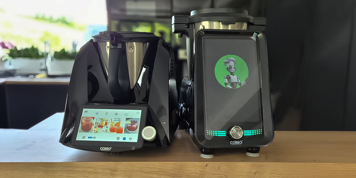
Porównaj roboty kuchenne COBBO 7
| COBBO 7 | COBBO 7 SMART-I | |
|---|---|---|
| Specyfikacja techniczna | ||
| Typ silnika | reluktancyjny, bezszczotkowy | szczotkowy |
| Maksymalne obroty | 11 000 | 5 500 |
| Moc urządzenia | 1500 W | 1700 W |
| Maksymalna temperatura grzania | 160°C | 140°C |
| Pojemność rzeczywista misy | 2.2L | 3.2L |
| Pojemność misy do przetwarzania gorących potraw | 2L | 2L |
| Pojemność naczynia parowego | 3L | 4.7L |
| Przekątna ekranu (w calach) | 7 | 10,1 |
| Funkcje i oprogramowanie | ||
| Połączenie Wi-Fi | ✔ | ✔ |
| Darmowa baza przepisów | ✔ | ✔ |
| Wbudowane programy gotowania | 12 | 15 |

Więcej niż wielofunkcyjny –
robot kuchenny, który stale się rozwija
Odkrywaj kolejne możliwości dzięki regularnym aktualizacjom i nowym wbudowanym funkcjom .


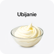
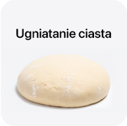
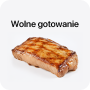
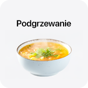

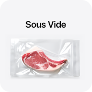
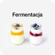
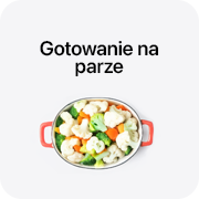
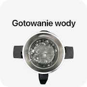




Innowacyjny design i ergonomia kształtu.
COBBO 7 SMART-I łączy nowoczesny, elegancki design z wyjątkową funkcjonalnością.

Wyprofilowane uchwyty po obu stronach misy. Wyjmowanie misy jest łatwiejsze i wygodniejsze w porównaniu do innych robotów kuchennych dostępnych na rynku.

Wbudowana, precyzyjna waga z zakresem pomiaru od 1 g to 5 kg, z dokładnością 1 g. Wyposażony w opcję kalibracji wagii.

Niewielkie rozmiary – wielkie możliwości. Kompaktowa budowa sprawia, że łatwo znaleźć dla niego miejsce nawet w mniejszych przestrzeniach, jednocześnie nie rezygnując z zaawansowanej funkcjonalności i wydajności.

Jeszcze większa pojemność
COBBO 7 SMART-I został wyposażony w większą, 3,2-litrową misę, idealną do przygotowywania posiłków dla całej rodziny lub na większe spotkania. Zwiększona pojemność pozwala na wygodne przygotowanie większych porcji, oszczędzając czas i wysiłek w kuchni.
Dodatkowo, urządzenie posiada duże naczynie parowe o pojemności 4,7 litra, co umożliwia zdrowe gotowanie na parze większych ilości składników. Maksymalna temperatura grzania wynosząca 140°C pozwala na szeroki zakres technik kulinarnych, od delikatnego duszenia po intensywne smażenie.


10,1 calowy
ekran dotykowy
Dzięki wysokiej rozdzielczości i responsywnemu interfejsowi, nawigacja po przepisach i ustawieniach staje się czystą przyjemnością.
Dzięki dużemu, 10,1-calowemu ekranowi dotykowemu obsługa COBBO 7 SMART-I jest niezwykle intuicyjna. Wysoka rozdzielczość zapewnia doskonałą czytelność, ułatwiając korzystanie z przepisów i funkcji urządzenia.
Co więcej, robot posiada filmy instruktażowe zintegrowane z przepisami, które pokazują dokładnie, jak wykonać każdy krok, co sprawia, że gotowanie jest jeszcze łatwiejsze, nawet dla początkujących kucharzy.

Parametry techniczne:
- Moc urządzenia:
- Miksowanie: 800 W
- Gotowanie: 1000 W
- Prędkość pracy: 10 poziomów
- Maksymalna temperatura grzania: 140°C
- Napięcie/częstotliwość: 220-240 V ~ 50/60 Hz
- Pojemność pamięci: 1 GB RAM / 8 GB ROM
- Łączność WiFi (2.4 GHz)
Cechy Fizyczne i Użytkowe:
- Model urządzenia: COBBO 7 Smart-I (ZS-CS66A01)
- Wymiary urządzenia:
- 37.8 x 28 x 38.7 cm (bez naczynia parowego)
- 39.3 x 28 x 56.1 cm (z naczyniem parowym)
- Waga produktu: 8.93 kg
- Pojemność misy: 3.2 L
- Pojemność naczynia parowego: 4.7 L
- Panel sterujący:
- Łączność: gniazdo 5 V
- Przekątna ekranu: 10.1 cala
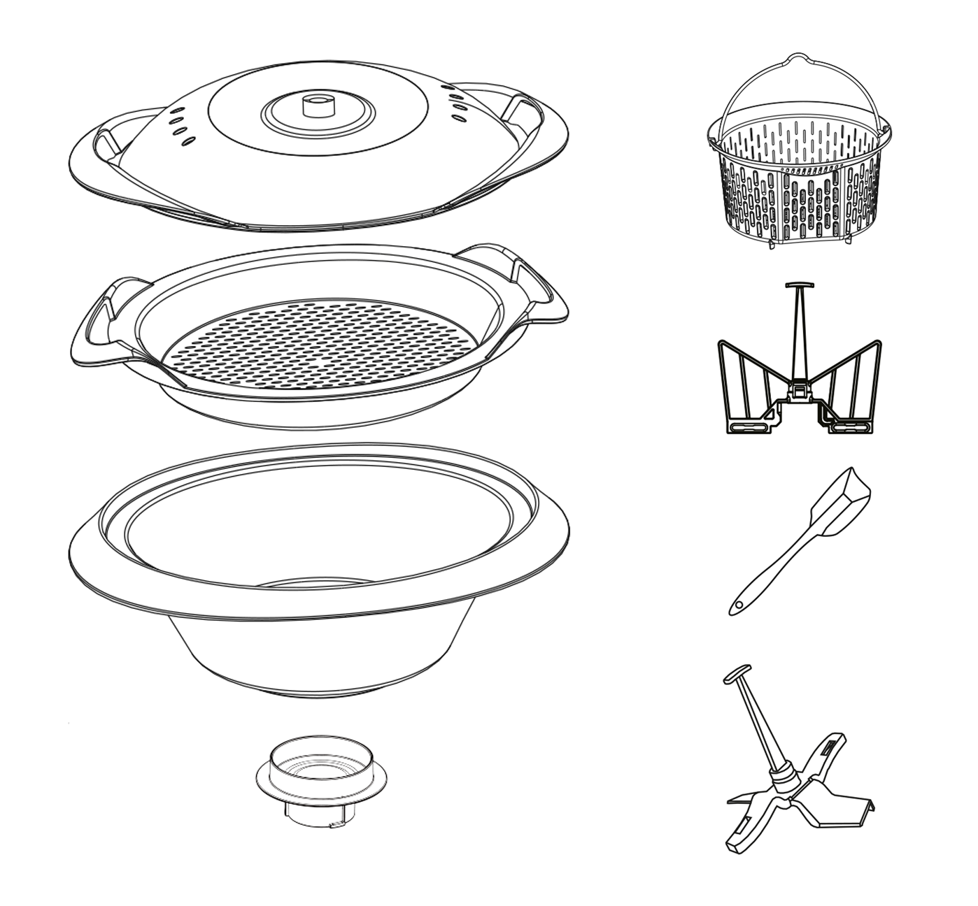
Zawartość zestawu
Dlaczego warto wybrać COBBO Robotics?

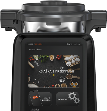



document.querySelectorAll(„.text-field”).forEach(function (element) { if ( element.textContent.includes( „Dostawa w drugiej połowie września 2024 r.”, ) ) { element.style.fontWeight = „bold”; element.style.color = „red”; } });
Specyfikacja
Dane produktu
| Marka | COBBO Robotics |
|---|---|
| Symbol | 411_157 |
| EAN | 5904463378773 |
| Kategoria | AGD do kuchni, Blendery, miksery i roboty |
| Dostępność | Dostępny |
Zakupy
Dostawa, płatność i zwroty
Dostawa i koszt przesyłki
Od 150 zł dostawa jest darmowa. Koszt wyliczany jest w koszyku na podstawie gabarytów, kraju dostawy i wybranego przewoźnika. Zamówienie z produktami z różnych magazynów może przyjść w kilku przesyłkach — podział i suma kosztów są widoczne przed zapłatą.
Zwrot i odstąpienie od umowy
Masz 14 dni na odstąpienie od umowy bez podania przyczyny. Szczegóły i adres do zwrotów znajdziesz w pouczeniu.
Reklamacja i niezgodność towaru
Reklamacje rozpatrujemy na zasadach opisanych w regulaminie i w informacji o rękojmi.
Do kompletu
Warto dobrać
Podobne
Inne propozycje z tego działu